Choosing Our Exterior Paint Color
How we chose our exterior paint color: Natural Choice from Sherwin Williams. (The runners up were Urbane Bronze and Iron Ore.)
If you follow along on our Instagram, you’ll know that I waffled over the perfect exterior color for our new cottage for months.

Initially we’d intended to select a muddy green, thinking it would help the structure blend into the woods in which it’s nestled. But we realized that the tones we had in mind somehow appeared to compete or clash with the year-round green leaves of the neighboring oaks.


It became apparent that in order to properly submerge the house in nature, we needed to coordinate with the dark brown trunks of the trees instead. Once we made this shift from greens to warm, deep browns, we were seeing the results we desired when testing swatches. I really liked Urbane Bronze and Iron Ore, and had a hard time deciding between the two. (It didn’t help that the rest of the family’s opinions were evenly divided between the two choices.)


During this time, however, I became concerned with the potential transfer of heat from a darkly painted exterior to the interior, as the southern wall of the house is the largest uninterrupted side, gets the most sun, and borders the kids’ play space and the area of the home that would end up storing all of our food. I also began to look at nearby homes and noticed that the mid-range and darker colors fade or change more noticeably than the lighter homes, plus the dirt from the roads off which we live appeared to cling to them. But what snapped me from my dreams of having a rich and dark cottage exterior was the moment I accidentally put my hand down on a piece of recently painted tester siding that I’d positioned in the sun to dry and it instantly burned my hand. I knew the moody paint I’d had my heart set upon just wouldn’t work in this particular application, no matter how badly I wanted it to.

So we pivoted to the other end of the spectrum, seeking a warm white that wouldn’t take on the blue of the sky or the green of the leaves, but also wouldn’t look too stark, bland, or out of place in the wooded setting. We also didn’t want anything too yellow or bright. We simply wanted an easygoing, Earthy tone that would call to the pale spots on the bark throughout the woods, and echo the sandy patches of soil snaking through the land.
We tried 4 options: Shoji White, Natural Choice, Antique White, and Summer White.


Not only didn’t it check off all the boxes we’d established once we pivoted to white, but it also worked beautifully with the recovered wood cypress soffits and the dark bronze Marvin windows.

From the very first moment the team began to apply the paint, we knew we’d chosen the right color for our project and taste.

The Emerald line is self-priming, with a resistance to blistering, peeling, fading and dirt pickup, as well as a mildew-resistant coating. It was a larger investment, but we believe it will save us money in the longer run given the temperature + humidity extremes of our region, torrential downpours, and the dusty, pollen-filled air that the exterior of the house will experience.

We decided to avoid contrasting trim, as the lines of the windows (with divided lites to prevent bird strikes), the reflections of the trees, and the natural variations in the oiled but unstained Cypress soffits provide more than enough visual interest. As such, the only paint color used on the exterior is Natural Choice.

I’ll have more photos of the exterior once the building supplies and equipment are moved, the porch is decorated, and the garden has been planted.

But for now, even as a work-in-progress, we couldn’t be happier with how the exterior turned out.

Note: Sherwin Williams gifted some of the exterior paint used on the exterior of the cottage. All opinions and choices are my own.
The Mini-Kitchen's Mini-Makeover
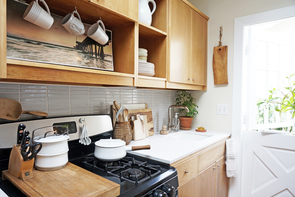
Our little kitchen is adorable, but has needed a makeover for YEARS. The countertops were thin slabs of black, white and grey speckled granite, the backsplash was unfinished, and the walls were patched with paint in mismatching levels of gloss. Seeing as how the Cottage is a major part of our lives and business, why on Earth would I wait so long?
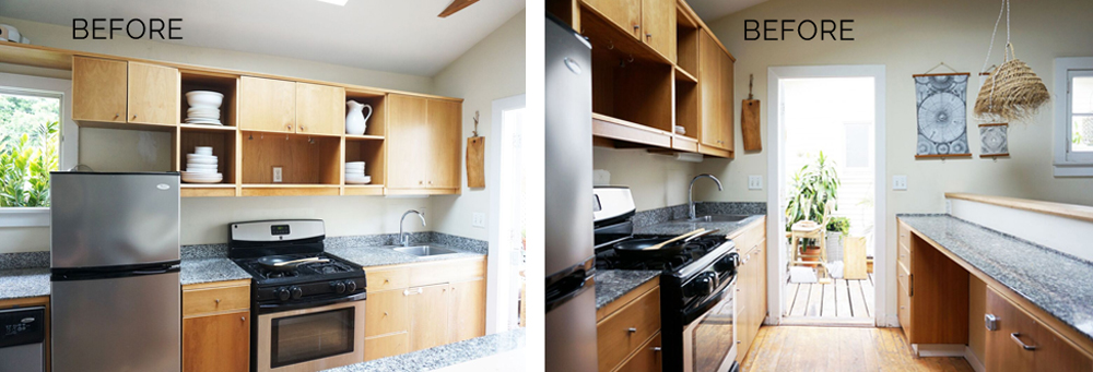
Here's the thing about renovations in a tiny home: you can't just relocate to another part of the house while work is being done. In a small place, there's no where to go to escape the fumes and dust. Add a home-based business, kids, and pets to the mix and there never, ever seems to be a good time to tackle any larger-scale updates and repairs. So I just kept putting it off... and years passed, as they do.
But since West is eating solid foods, we're finding ourselves spending more and more time in the kitchen together... and I started getting actively annoyed by the countertops. I could never see if they were actually clean, and I felt like they were making the space feel darker, smaller and more cramped than it actually is. As I paid more attention to the counters, the conditions of the sink, faucet, and walls all started to stab at my eyeballs, too. I knew I couldn't put it off any longer. Our neighbor agreed to let us stay at his place for 2 days while he was out of town, so we pounced on the opporunity and started planning.
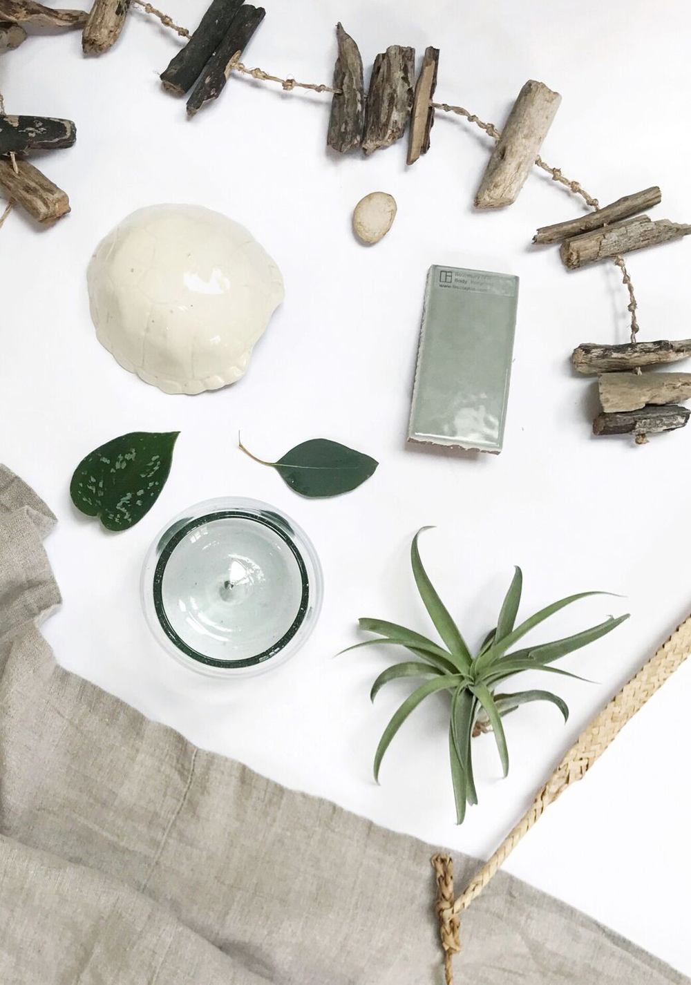
Rather than exploring other kitchens online for inspiration, I pulled materials, textures and colors that inspired me. Then I decided what parts of the kitchen needed immediate attention, as we were operating under a tight timeline, and within a strict budget. Adam and I agreed that the cabinetry and appliances could wait, and that we'd focus instead on the countertops, paint, repairs, backsplash/tiling, and sink.
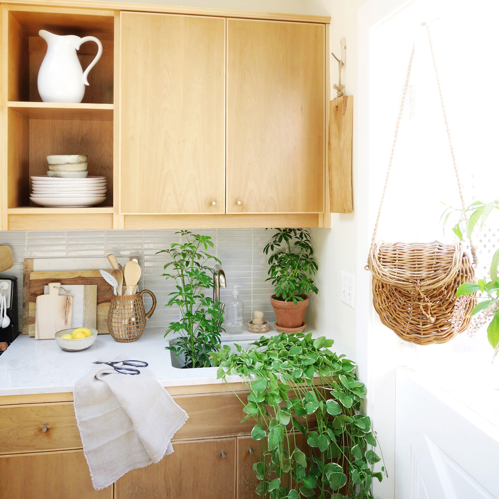
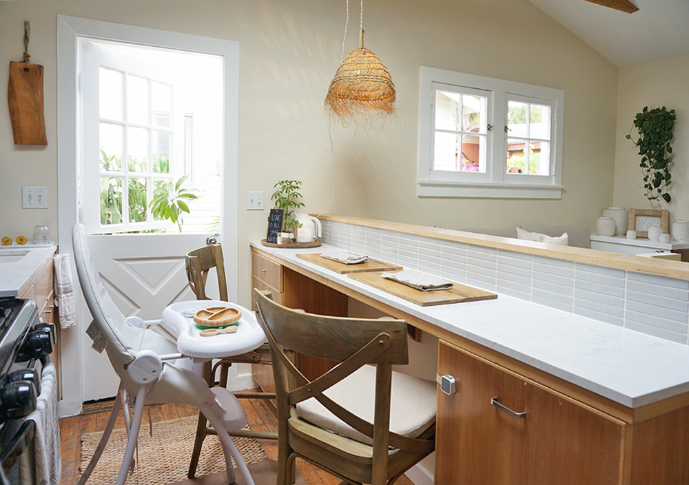
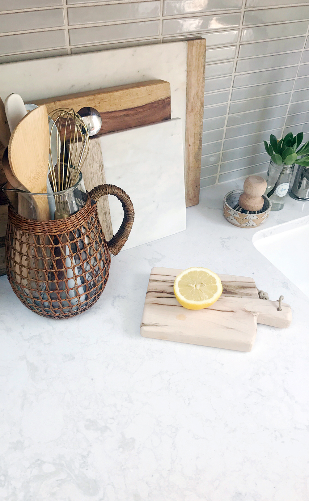
I was craving bright countertops, but I also wanted something with slight texture. Nothing overly marble-y, nothing speckled, and nothing too heavy in appearance. While thick countertops are lovely and certainly on-trend, we wanted something in between-- not too thin, but not so chunky that they looked out of place in our tiny kitchen. And in order to help increase the light and visual space within the room, we wanted something slightly reflective. We found the PERFECT answer to all of these requirements via Cambria's Torquay countertops. I love the characteristics of Torquay-- it's like sand and marble made a baby together:

The planning / measuring, removal of the old counters, and the installation of the new tops were a breeze. Both visits combined took under 4 hours. I can't believe I waited 6+ years for this update. It's made a HUGE difference in our home, and we LOVE it.
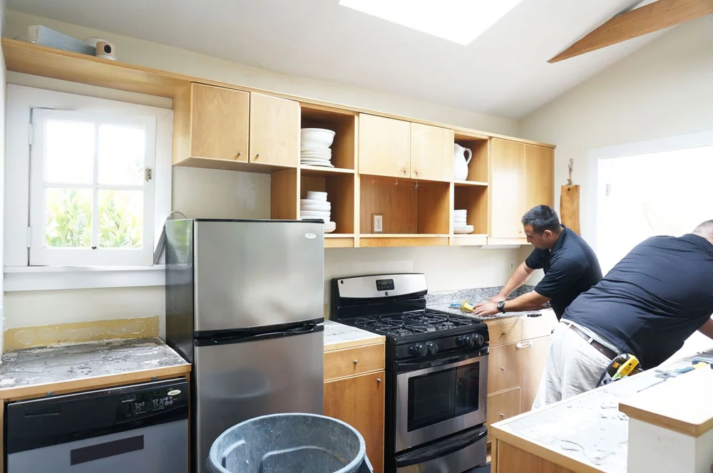

Next up was the tile for the kitchen and breakfast bar counter backsplash. I knew I wanted Fireclay. I think their handmade tiles are just so gorgeous. I initially wanted to use their Picket shape, as it mirrors the fence supporting the grapevines outside. I'd also planned to go with Rosemary, which is a muted yet distinct shade of green.
At this point, I called my incredibly talented friend, former neighbor and tiny house expert Kim Lewis for her input. While I consult on tiny home decor every day, I find that it's handy to get an outside opinion when working on the Cottage, specifically. It helps me get out of my bubble and see things differently. And Kim is the best. She knows me. She knows tiny homes. And she knows design. Kim and I decided that the Picket shape was wonderful, but just too large for this project. But neither one of us wanted a particularly modern shape, and we wanted to steer clear of subway tiling. We opted instead for a 1/6 cut. It's tiny, like our home, and rectangular like all of the built-ins and shapes throughout the house. We also updated our color selection, picking French Linen, which is a light shade of pale grey with a beige undertone. It's a perfect balance between cool and warm notes, and has a semi-reflective sheen to bounce light around our small space:


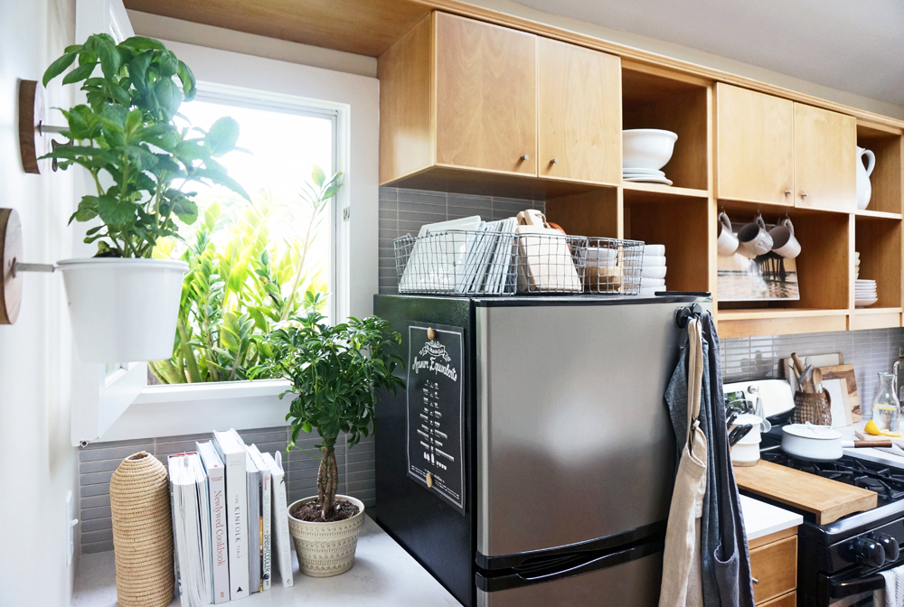
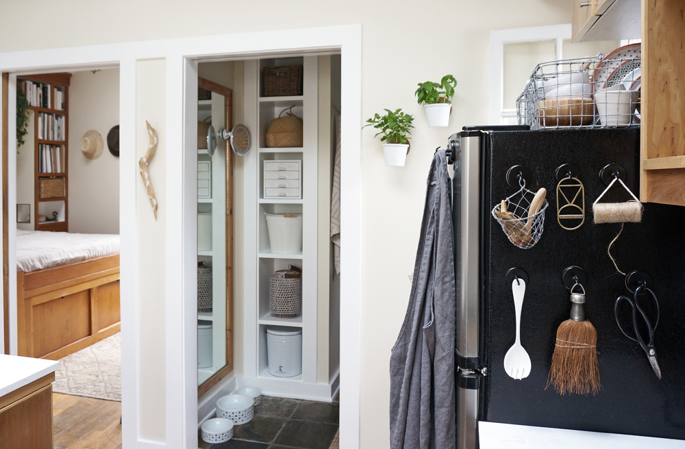
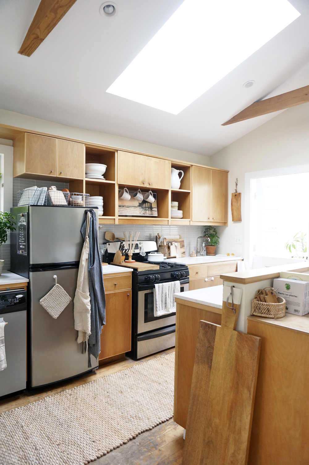
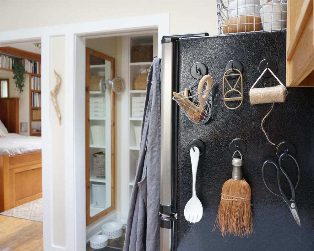
We used to hang smaller kitchen tools and accessories from the backsplash walls, since there was nothing there before. Now, with the tile in place, we moved the accessories to magnetic hooks on the refrigerator, which work just as well, and make the space look more organized and simplified.
With the new backsplash tile and countertops, it seemed silly to leave our cheap old sink and faucet in place. We upgraded to a white undermount Kohler, measuring about 17x18". (We installed it sideways to provide us with wider access, and more counter space for the faucet and soaps. We installed a small Purist pull-out spout faucet in vibrant polished nickel. It measures under a foot tall, so it fits well in our compact kitchen.

The final step was to repaint the kitchen, and repair various damage to the walls that built up over the years. We figured that it was time to repaint the entire interior of the cottage-- including the ceilings. We moved most of our items to the laundry shed and garden for 2 days and nights while the painting was underway. (Luckily the LA weather had our backs, and nothing was damaged in the process.)

We adjusted our wall color ever-so-slightly, and picked a slightly warmer, earthier hue than the previous yellow-tinted version. We used "Muscat Blanc" Everest paint by Dunn Edwards. We selected the Velvet finish, which is easier to clean than Flat-- an essential, given the baby and the pups. We used Flat White on the ceilings, and Semi-Gloss White for the moldings.
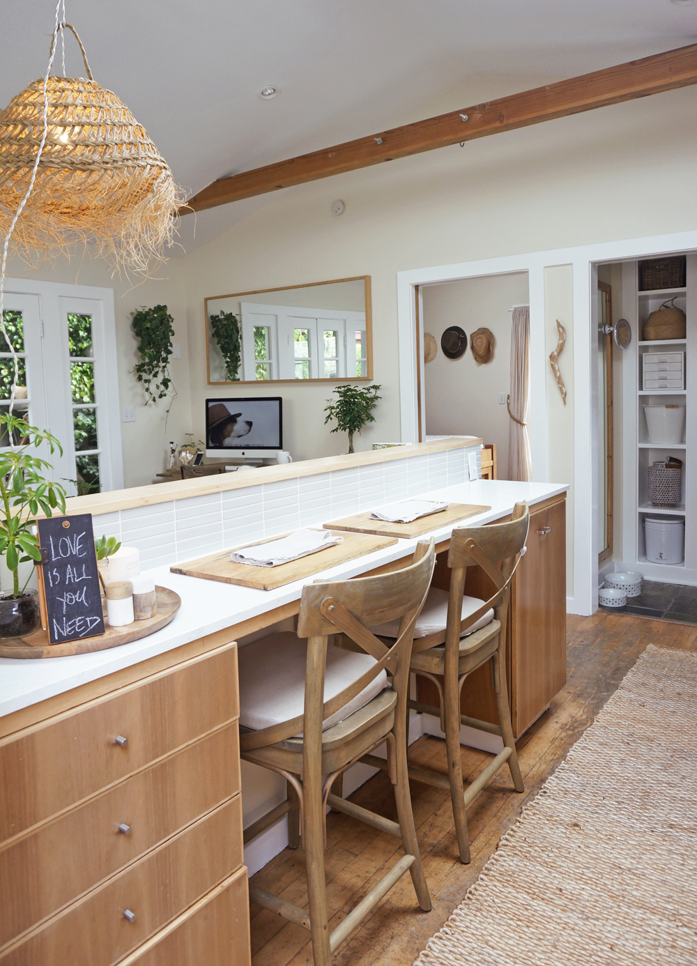
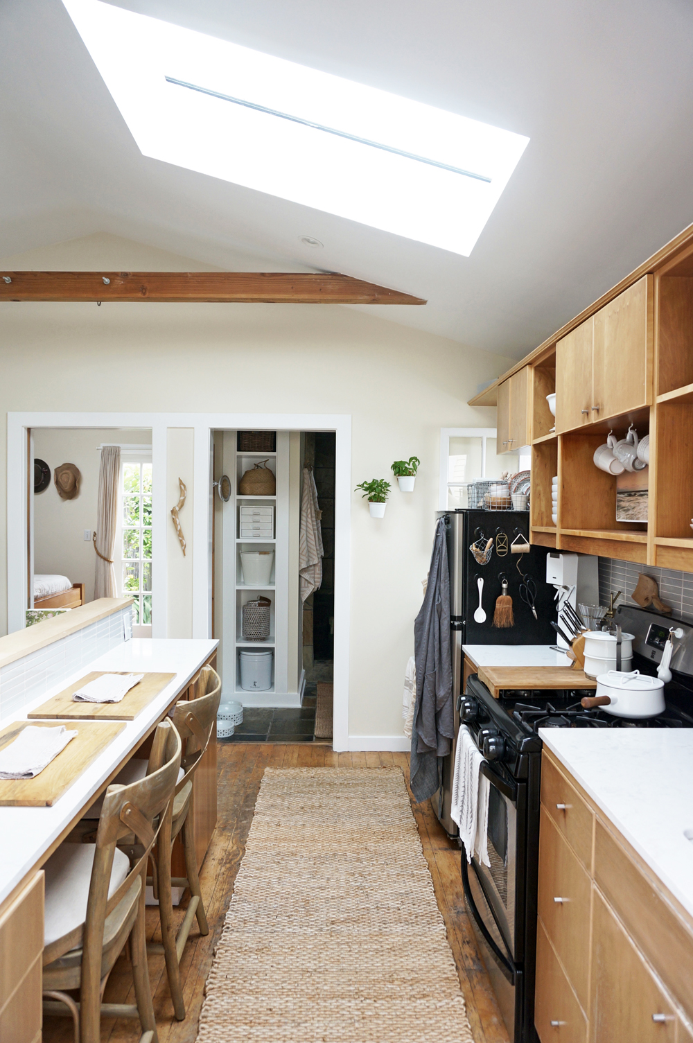
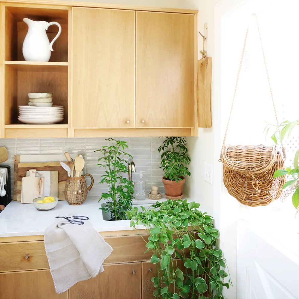
We are so happy with our tiny kitchen's new appearance. I'm looking forward to sitting here with my little family for years to come.