
Family, Small Space Living Whitney Leigh Morris Family, Small Space Living Whitney Leigh Morris

Multifunctional Furnishings for the Children’s Shared Bedroom

Click here to explore the general post about the the children’s shared bedroom / playroom. 

We have two children, ages 6 and (almost) 2. When designing the interior of their shared, 11 x 12’ bedroom, I wanted to be sure they’d each have dedicated spaces of their own, as well as ample room for overlapping or independent free-play. The trick was, of course, how to fit toy storage, wardrobes, learning stations, relaxation zones, sleep areas, and open space for both of the kids within the given floorpan. 

There are two key elements of the room that helped us achieve our goals. One is the convertible bunk bed, which is detailed in full via this post. The second is a wall-to-wall, multitasking collage of carefully selected furnishings and accents:

  • One repurposed, shallow-depth kitchen pantry

  • Two benches (with raised legs)

  • Two removable, no-slip seat cushions

  • One child-sized chair 

Truth be told, we’d originally designed a built-in with the same function and look-and-feel for this space, but our budget was too strained to accommodate it by the end of the home-build process. 

We pivoted, customizing a slim, pine kitchen pantry and two benches instead, which we painted in the same hue as the ceiling, and grouped in a way that echoes the more polished design we’d intended to bring to life from scratch but ultimately could not. 

The shallow-depth pantry, which is secured to the wall with essential, anti—tip hardware for safety, is in use as a wardrobe for both children. We opted to skip the addition of a dowel for hanging garments, though we’ll likely add that later as the kids get older. In the meantime, each shelf contains two collapsable storage cubes that function like clothing drawers.

The two benches both have custom, no-slip seat cushions for moments when the kids want to use the surfaces as reading zones. 

Above: Cushioned benches for reading zones

Above: Benches in use as desks

The cushions can then be removed to convert the benches to desks (or to create forts for parents to stumble over). 

We raised the benches with 2” cubes so that little chairs and seated kiddos can easily fit the same way they would at a desk. One toddler / pre-schooler vintage chair is ever at the ready, and the second seat is supplied by a sturdy arch from an Arc Indoor Playset.

The desks are curtained with repurposed bed linens, concealing ample toy storage that consists of 11” x 11” collapsible cloth cubes. 

Four cubes sit beneath one bench, two beneath the other. 

(Book storage is elsewhere within the room.) 

These multitasking pieces allowed us to create a highly functional room without the need for built-in closets, bulky dressers, or separate lounge chairs and tables. As such, there’s more room for open play (and the blasted, aforementioned forts) without the need for more square-footage.

Read More
Small Space Living, Before + After Whitney Leigh Morris Small Space Living, Before + After Whitney Leigh Morris

Choosing Our Exterior Paint Color

How we chose our exterior paint color: Natural Choice from Sherwin Williams. (The runners up were Urbane Bronze and Iron Ore.)

If you follow along on our Instagram, you’ll know that I waffled over the perfect exterior color for our new cottage for months.

Initially we’d intended to select a muddy green, thinking it would help the structure blend into the woods in which it’s nestled. But we realized that the tones we had in mind somehow appeared to compete or clash with the year-round green leaves of the neighboring oaks.

It became apparent that in order to properly submerge the house in nature, we needed to coordinate with the dark brown trunks of the trees instead. Once we made this shift from greens to warm, deep browns, we were seeing the results we desired when testing swatches. I really liked Urbane Bronze and Iron Ore, and had a hard time deciding between the two. (It didn’t help that the rest of the family’s opinions were evenly divided between the two choices.) 

During this time, however, I became concerned with the potential transfer of heat from a darkly painted exterior to the interior, as the southern wall of the house is the largest uninterrupted side, gets the most sun, and borders the kids’ play space and the area of the home that would end up storing all of our food. I also began to look at nearby homes and noticed that the mid-range and darker colors fade or change more noticeably than the lighter homes, plus the dirt from the roads off which we live appeared to cling to them. But what snapped me from my dreams of having a rich and dark cottage exterior was the moment I accidentally put my hand down on a piece of recently painted tester siding that I’d positioned in the sun to dry and it instantly burned my hand. I knew the moody paint I’d had my heart set upon just wouldn’t work in this particular application, no matter how badly I wanted it to. 

So we pivoted to the other end of the spectrum, seeking a warm white that wouldn’t take on the blue of the sky or the green of the leaves, but also wouldn’t look too stark, bland, or out of place in the wooded setting. We also didn’t want anything too yellow or bright. We simply wanted an easygoing, Earthy tone that would call to the pale spots on the bark throughout the woods, and echo the sandy patches of soil snaking through the land. 

We tried 4 options: Shoji White, Natural Choice, Antique White, and Summer White.

Not only didn’t it check off all the boxes we’d established once we pivoted to white, but it also worked beautifully with the recovered wood cypress soffits and the dark bronze Marvin windows.

From the very first moment the team began to apply the paint, we knew we’d chosen the right color for our project and taste. 

The Emerald line is self-priming, with a resistance to blistering, peeling, fading and dirt pickup, as well as a mildew-resistant coating. It was a larger investment, but we believe it will save us money in the longer run given the temperature + humidity extremes of our region, torrential downpours, and the dusty, pollen-filled air that the exterior of the house will experience. 

We decided to avoid contrasting trim, as the lines of the windows (with divided lites to prevent bird strikes), the reflections of the trees, and the natural variations in the oiled but unstained Cypress soffits provide more than enough visual interest. As such, the only paint color used on the exterior is Natural Choice.

I’ll have more photos of the exterior once the building supplies and equipment are moved, the porch is decorated, and the garden has been planted.

But for now, even as a work-in-progress, we couldn’t be happier with how the exterior turned out.

Note: Sherwin Williams gifted some of the exterior paint used on the  exterior of the cottage. All opinions and choices are my own. 

Read More
Eco, Before + After Whitney Leigh Morris Eco, Before + After Whitney Leigh Morris

Lime Painting the Cottage Walls

One delightful way to achieve depth and texture in a small space without cluttering up the square-footage is through the application of lime paint.

Main bedroom, work in progress.

For this reason, among others explored below, we opted to paint our new 11’ x 12’ bedroom with Color Atelier lime paint in “Cobblestone,” — a mossy, matte, green-brown.

Lime paint creates subtle movements with natural color variations on interior and exterior surfaces. Color Atelier Lime Paint is natural and mineral-based, which can be used safely in areas with children and pets.

This paint is made with traditional European techniques known for removing toxins, odors and harmful CO2 from interior air, thus improving interior air quality.

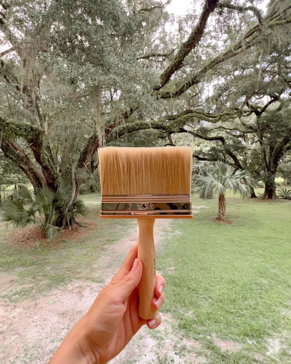
Color Atelier Lime Paint is user friendly and it is simple apply it by yourself using a block brush in random, multi-directional strokes— no special techniques or faux methods required; the lime will create the effect in a natural way.

It is non-flammable, free of odor and VOCs, free of solvents, and toxic chemicals, and is composed of all natural materials and mineral pigments.

Lime’s high pH makes it a mold and mildew resistant finish. It also means that microorganisms can’t survive, which adds an hypoallergenic quality.

I typically like to reflect on a space and navigate around it for some time before making design decisions. In this case, I waited for the Lime Paint in the main bedroom of our new cottage to dry and viewed it in all sorts of light conditions before deciding that we definitely needed to include the ceiling:

We’re thrilled with the “Cobblestone”— so much so that we wish we’d painted the entire interior with various hues of Lime Paint, rather than standard paint. (But it will give us an update to look forward to years down the road!)

Below are three videos of the paint process that I shared on Instagram in real-time:

Note: The descriptions of the Lime Paint and the Cobblestone color are from the Color Atelier website.

Read More